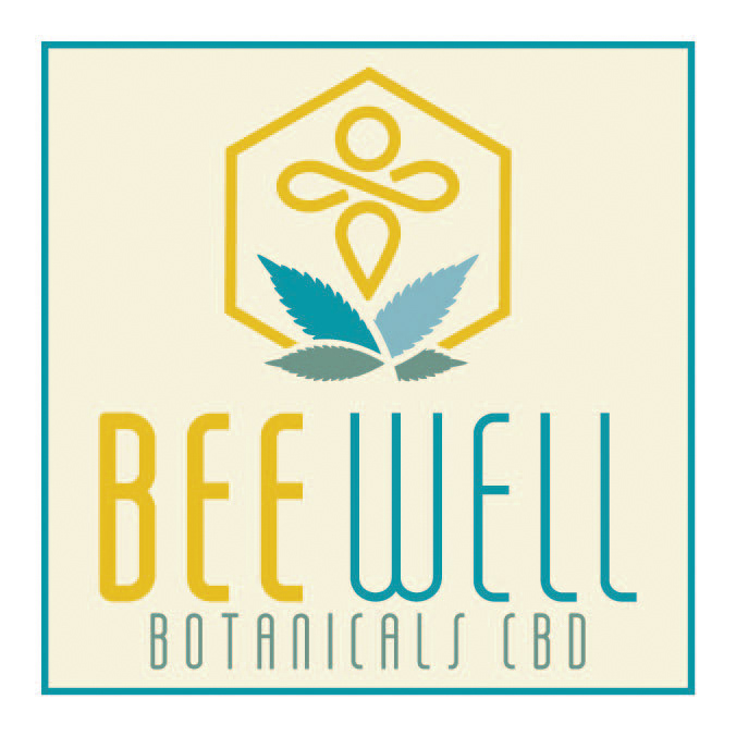
Old Logo
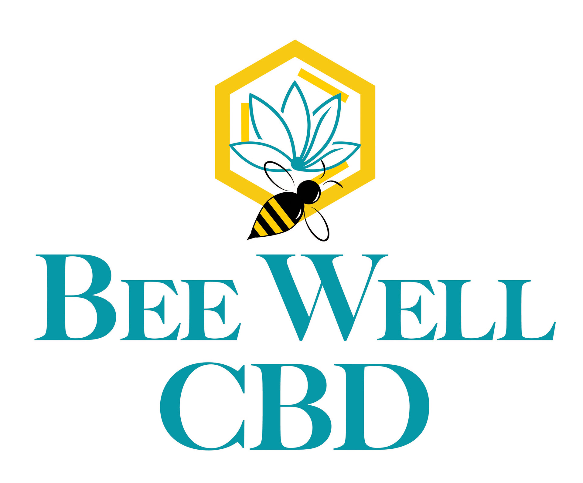
New Logo
Bee Well CBD wanted me to redo their logo. The company has the environment of a hometown market with inviting staff. I wanted to go with a logo that had thinner lines but still use the bee and bee hive section. I created a symbol that represents a bee and enclosed it with the beehive and hemp plants. I combined it with a tall thin typeface, Salah. I’ve had nothing but positive feedback on the new logo from employees and customers.