Zeditate Rebrand
Background
Zeditate, a company specializing in customizable, desk-sized zen gardens, sought to reposition itself as a self-help enterprise rather than being perceived merely as a toy manufacturer. This strategic rebranding aimed to attract a new audience and increase revenue.
Problem Statement
The primary challenge was to overhaul the brand identity to reflect this new positioning, distinguishing Zeditate from competitors while maintaining recognition as a toy manufacturer. The goal was to craft a brand that embodies tranquility, creativity, and therapeutic value.
Features and Benefits
The benefits of Zeditate’s zen gardens lie in their unique combination of aesthetic beauty and functional tranquility, offering a perfect balance of relaxation and mindfulness. Each garden is crafted with high-quality materials, ensuring both durability and elegance. The customizable features enable users to personalize their zen experience, fostering a deeper connection with their inner peace. With Zeditate, you don’t just own a toy; you embrace a sanctuary of calm and creativity, making it an essential addition to any home or office space.
Brand Communication
Diversion is what Zeditate is all about because it encapsulates the idea of providing a peaceful escape from daily stress and routine. Zeditate’s zen gardens offer a therapeutic retreat, allowing users to shift their focus from life’s pressures to a calming, mindful activity. This concept highlights our product’s ability to create a mental break, fostering relaxation and creativity.
Copywriting
The tone and feel of the copywriting for Zeditate’s zen gardens should be serene, inviting, and sophisticated. It should evoke a sense of calm and tranquility, reflecting the peaceful experience the product offers. The language should be elegant yet accessible, focusing on the therapeutic and aesthetic benefits. Descriptive and emotive words should paint a vivid picture of the serene retreat users can create. The overall tone should inspire mindfulness and well-being, positioning Zeditate’s zen gardens as a pathway to inner peace and creative expression.
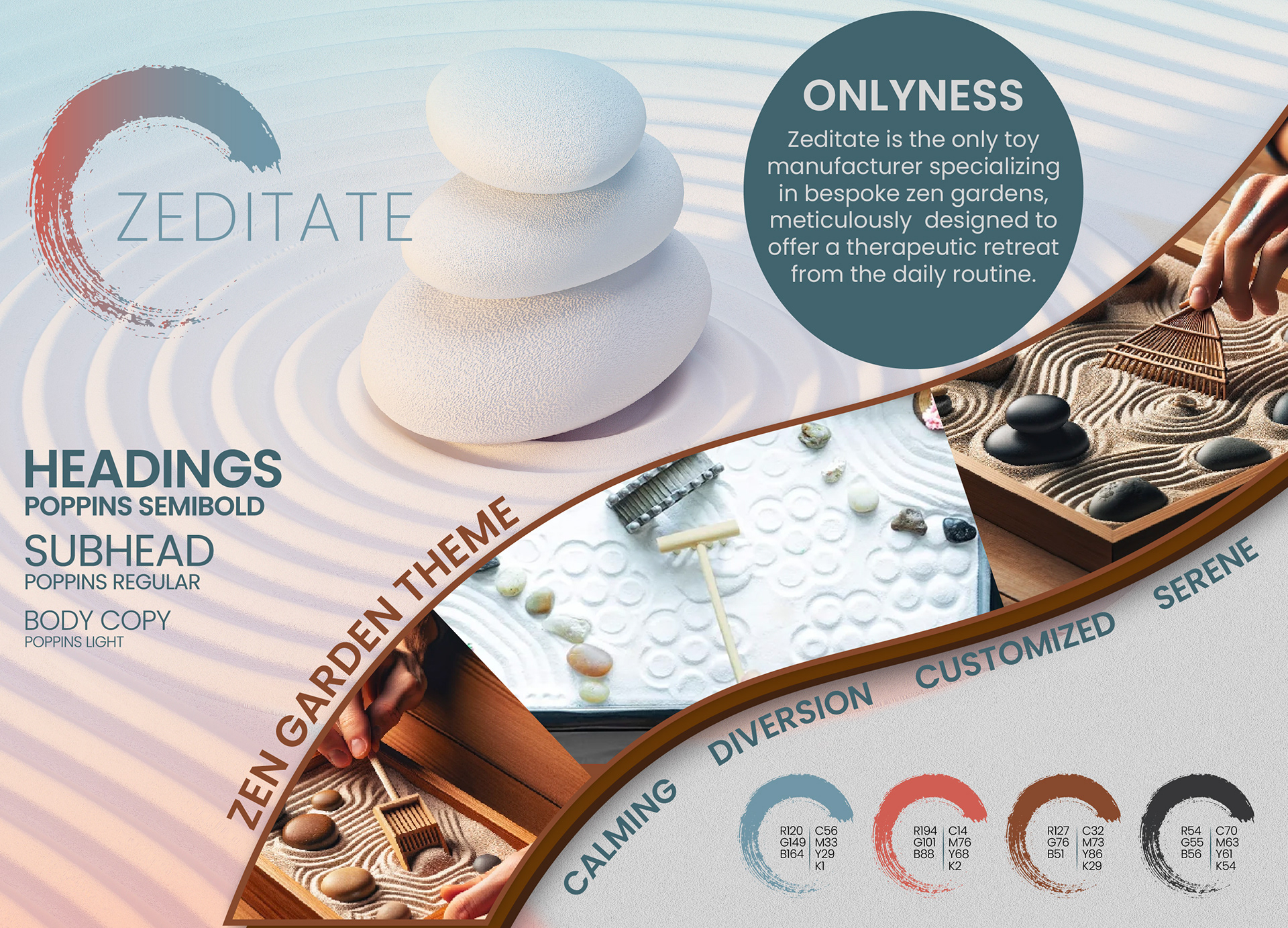
Onlyness Statement
“Zeditate is the only toy manufacturer specializing in bespoke zen gardens, meticulously designed to offer a therapeutic retreat from daily routine.”
New Tagline
“Crafting Serenity,” encapsulating the brand’s commitment to tranquility and calming experiences.
Visual Identity
The visual elements of Zeditate’s zen gardens, from the soothing color palettes to the minimalist design, all work together to create a serene and harmonious aesthetic. This peaceful appearance not only reflects the therapeutic benefits of the product but also invites users to experience a sense of relaxation and inner calm. The overall brand look is designed to evoke a feeling of peace, making it an ideal addition to any environment seeking to promote mindfulness and well-being.
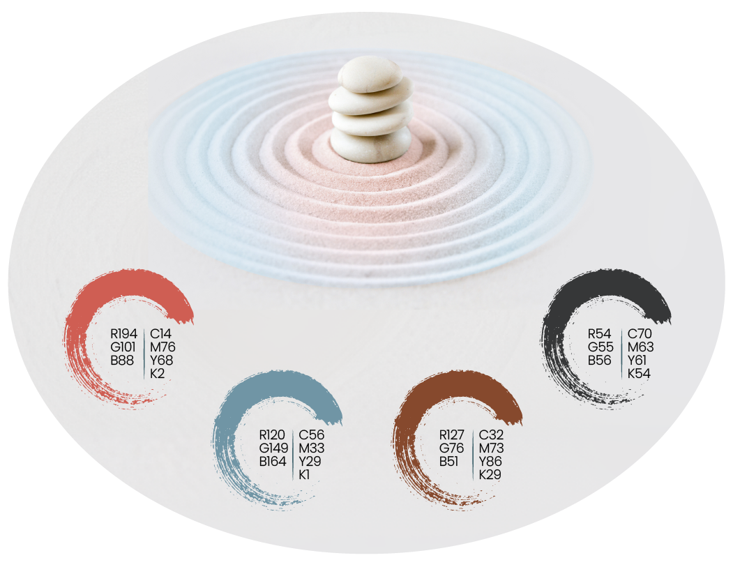
Color Palette
The color palette for Zeditate’s branding is soothing and harmonious, featuring soft, muted tones that evoke a sense of calm and tranquility. These colors should blend seamlessly to create a serene visual experience, enhancing the overall feeling of peace and relaxation. The palette was carefully chosen to ensure that it promotes mindfulness and well-being, making the brand a visually soothing retreat from the stresses of daily life.
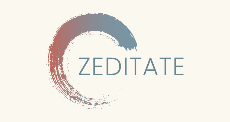
Logo
The final logo needed to encapsulate the essence of Zeditate, reflecting its personality and the zen garden products it offers. Through extensive sketching, refinement, and exploration, the ultimate design emerged as a simple zen circle encompassing the name "Zeditate" in a thin font style. The zen circle represents the brand’s theme, products, and core personality, while the thin Poppins font, with its slightly rounded corners, exudes calmness and tranquility. This final logo is ideally suited for Zeditate’s rebranding efforts, effectively conveying its identity and values.
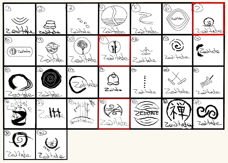
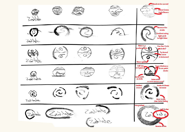
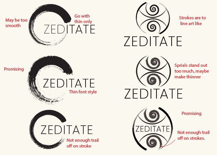
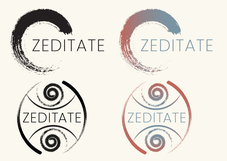
Final Logo
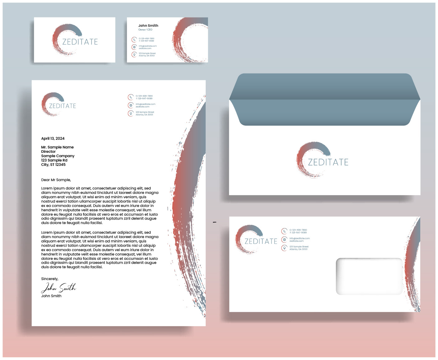
Stationary
A cohesive stationery package is crucial for Zeditate as it reinforces the brand’s identity and professionalism across all touchpoints. Consistent use of the Poppins typeface, serene color palette, and elegant logo design in business cards, letterheads, and envelopes ensures a unified and polished appearance. This attention to detail enhances brand recognition and conveys a commitment to tranquility and mindfulness in every aspect of communication.
Imagery
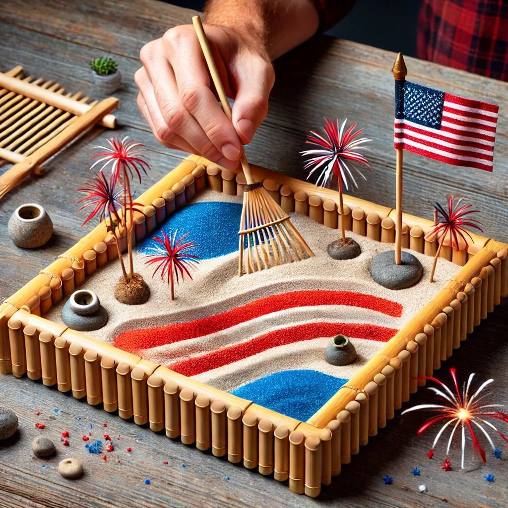
Selecting images of Zen gardens and individuals interacting with these serene spaces is ideal for Zeditate's theme. These visuals encapsulate Zen philosophy, emphasizing harmony with nature, mindfulness, and inner peace. Showcasing Zen gardens conveys tranquility and aesthetic simplicity, embodying the 'less is more' principle and encouraging inward reflection.
Including images of people engaging with Zen gardens adds a human element, illustrating their potential for personal connection and stress relief. It highlights the gardens' role as sanctuaries for contemplation, making them relevant and accessible to those seeking solace from daily life
.
The typography chosen for the Zeditate website, as well as all other media, is the Poppins typeface. This modern, clean, and versatile font complements the brand’s serene and elegant aesthetic. Its geometric simplicity and readability enhance the overall sense of calm and mindfulness that Zeditate aims to evoke. By maintaining consistency with the Poppins typeface across all platforms, we ensure a cohesive and harmonious visual identity that aligns perfectly with our brand’s commitment to tranquility and sophistication.
Marketing Strategy
Social Media
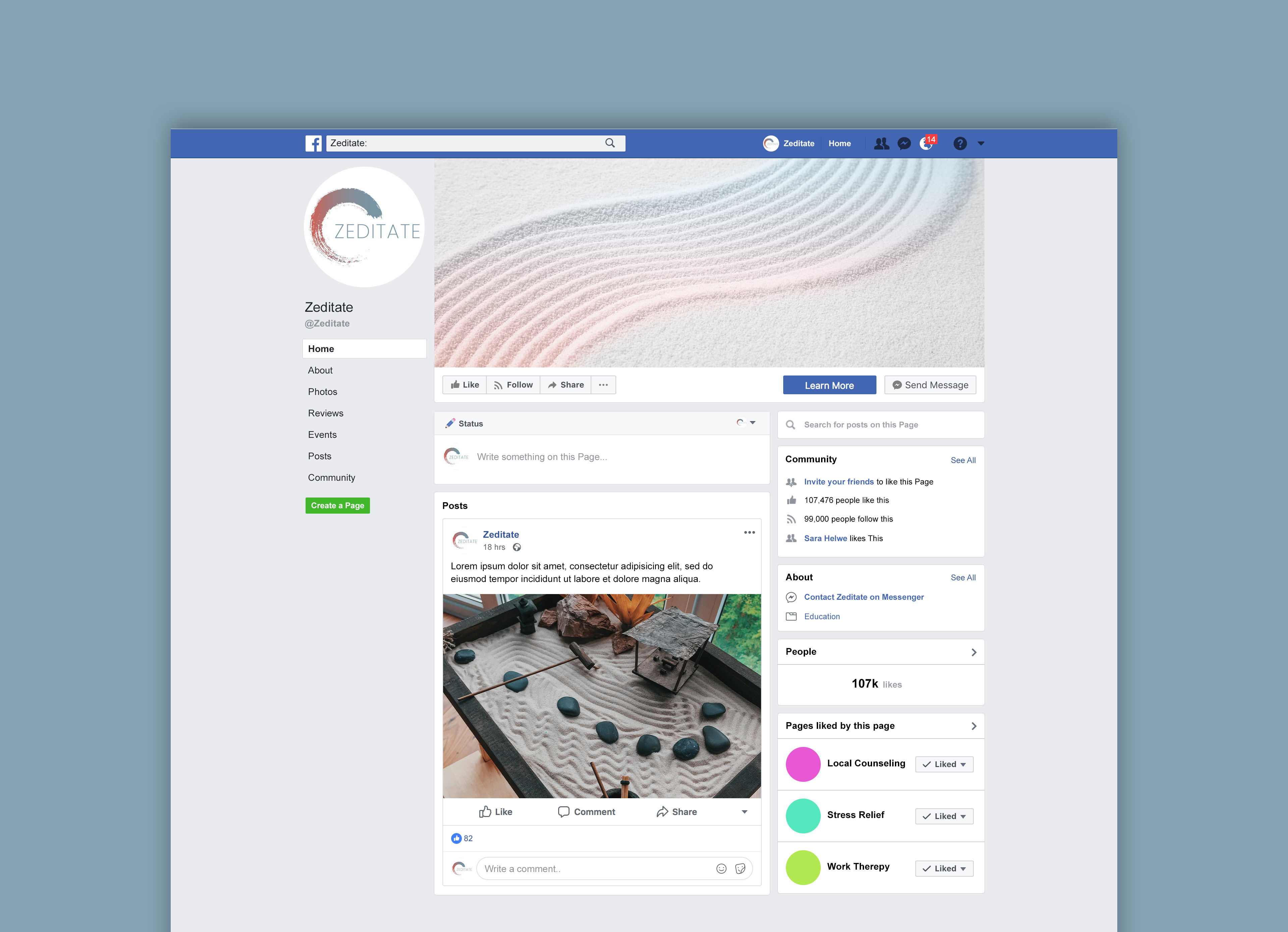
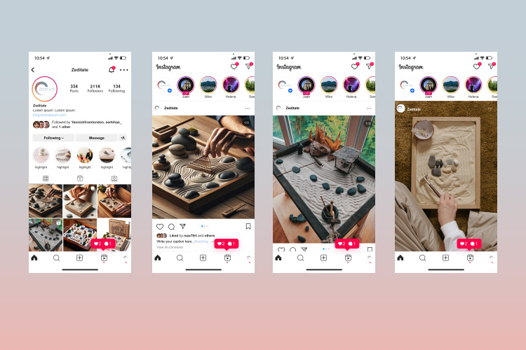
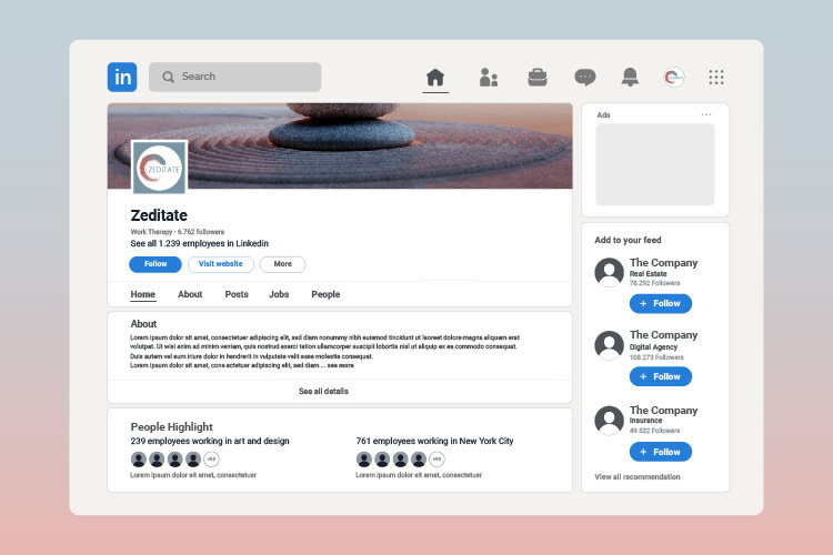
The social media strategy developed for Zeditate incorporated bespoke designs tailored specifically for Facebook, Instagram, and LinkedIn. These platforms were strategically selected based on comprehensive research indicating that they are predominantly utilized by Zeditate’s target demographic. The objective was to ensure that each post not only adhered to but also exemplified the brand's unified voice, tone, visual style, and overall ethos.
To achieve this consistency across platforms, each image employed in the posts featured gradient colors from the logo, subtly overlaying them to introduce a cohesive color scheme that aligns with the brand's visual identity. The imagery selected showcased Zeditate’s products in actual use, directly reflecting the brand's core message and fulfilling the aesthetic requirements outlined in the style guide.
This meticulous approach to the social media content ensures that Zeditate’s brand personality is consistently communicated across all channels. The aim is to engage the target audience in a meaningful way, presenting a uniform brand experience that resonates with users and reinforces Zeditate’s position in the market as a provider of therapeutic and aesthetically pleasing zen gardens.
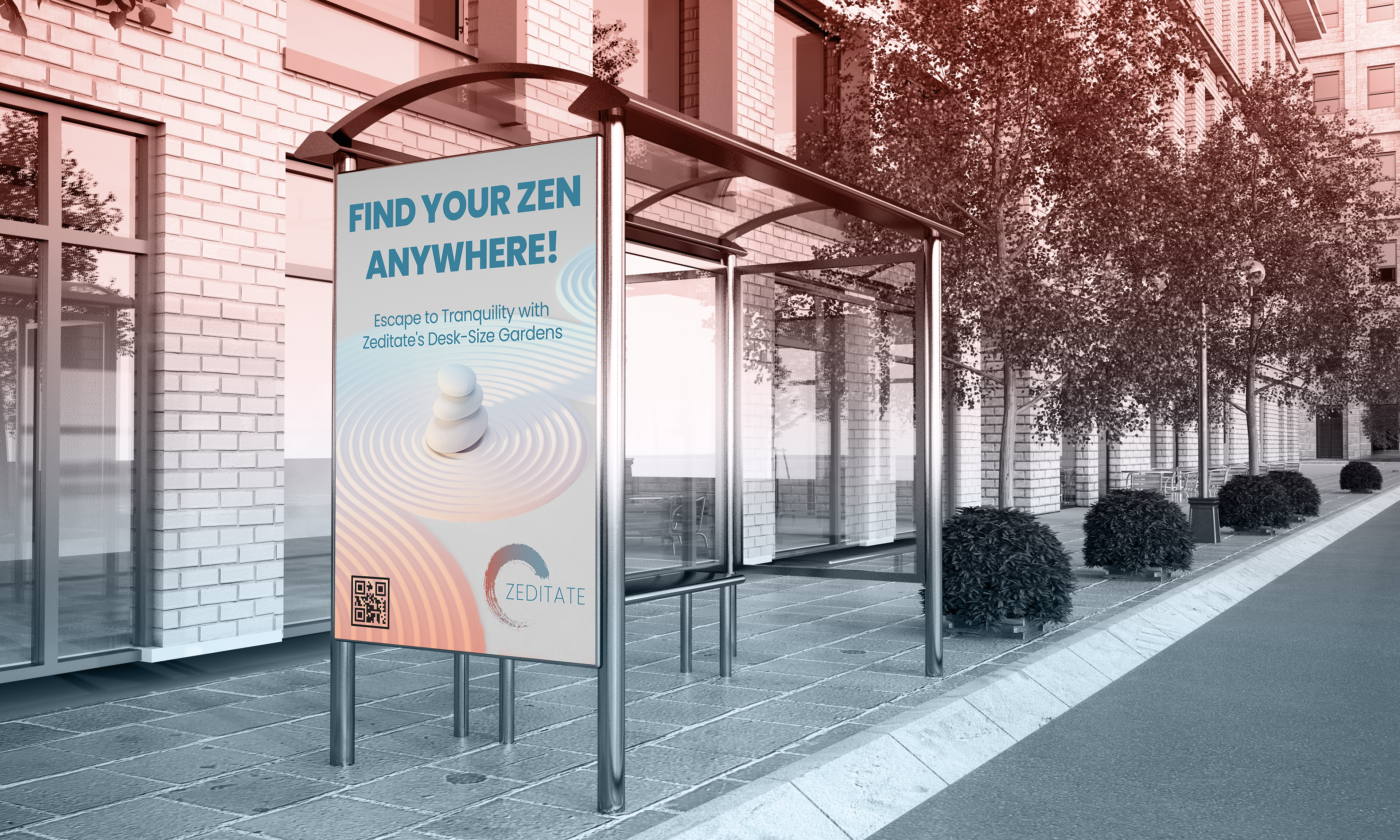
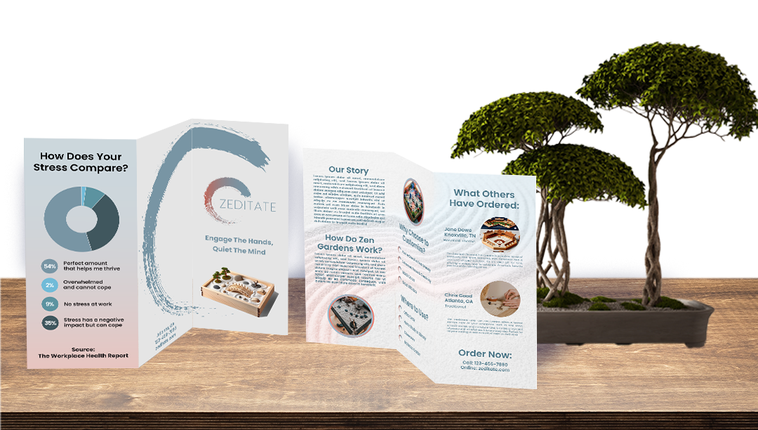
The trifold brochure allows for detailed information about the bespoke zen gardens, showcasing their therapeutic benefits and customizable features in a portable, easy-to-distribute format. Meanwhile, a bus stop poster provides high visibility in a public space, capturing the attention of busy commuters and inviting them to consider a moment of tranquility amidst their hectic routines. Together, these media formats enhance brand awareness and provide potential customers with both in-depth insights and immediate visual appeal.
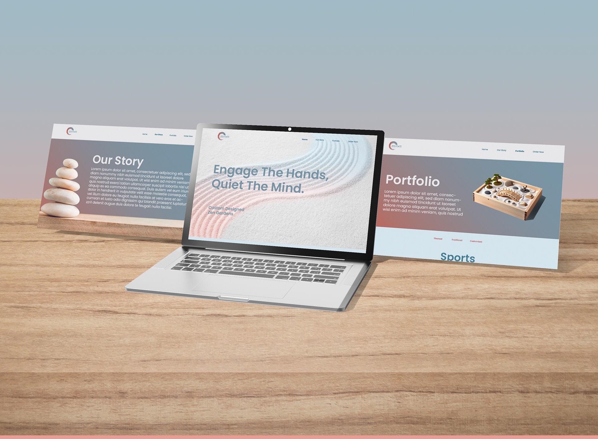
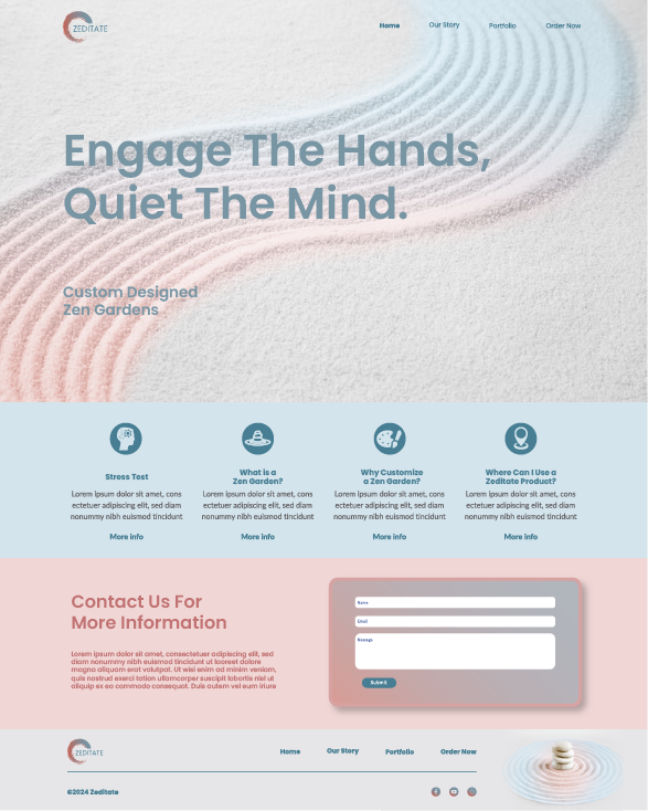
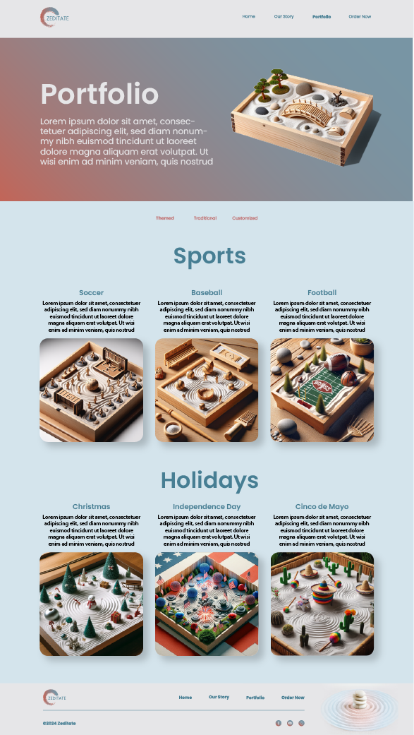
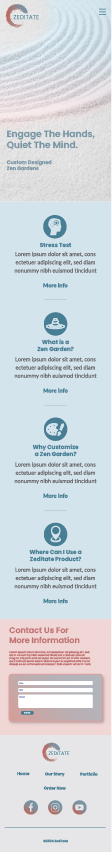
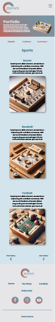
The web and mobile design of Zeditate embodies the same serene and elegant aesthetic as our typography and imagery. This cohesive approach ensures a seamless and tranquil user experience across all digital platforms, reflecting our commitment to mindfulness and well-being.


Execution and Results
To support the rebranding of Zeditate, a suite of comprehensive marketing tools was developed and implemented. This included the creation of a new letterhead package, which provided a consistent and professional brand appearance across all corporate communications. Additionally, strategic social media content was crafted to engage and attract the target audience across platforms such as Facebook, Instagram, and LinkedIn. A captivating logo animation was also designed to bring a dynamic element to the brand, enhancing visual appeal and recognition. The website underwent a thorough redesign, featuring an interactive and user-friendly interface that aligned with the new brand identity.
The rebranding efforts significantly elevated Zeditate's market position, clearly distinguishing it as a provider of therapeutic and aesthetically pleasing zen gardens. This strategic transformation not only enhanced brand recognition but also fostered a strong emotional connection with the target audience. By emphasizing the therapeutic benefits and aesthetic appeal of the zen gardens, Zeditate successfully communicated its value proposition, leading to increased customer engagement and loyalty. The cohesive brand identity and targeted marketing strategies effectively conveyed the essence of Zeditate, resonating deeply with consumers seeking tranquility and mindfulness in their daily lives.