Bee Well Botanicals, a burgeoning CBD enterprise based in Kennesaw, GA, entrusted me with the task of rebranding their identity. The only stipulation was to retain the distinctive bright marine blue from their previous branding, granting me considerable creative latitude in other aspects.
The ethos of Bee Well Botanicals is rooted in highlighting the health benefits of CBD, with a clear directive to distance the brand from the stereotypical imagery of a head shop. In response, I crafted a logo that exudes professionalism and chose a color palette that aligns with the health industry's standards.
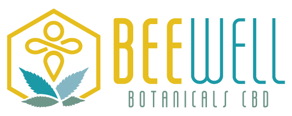
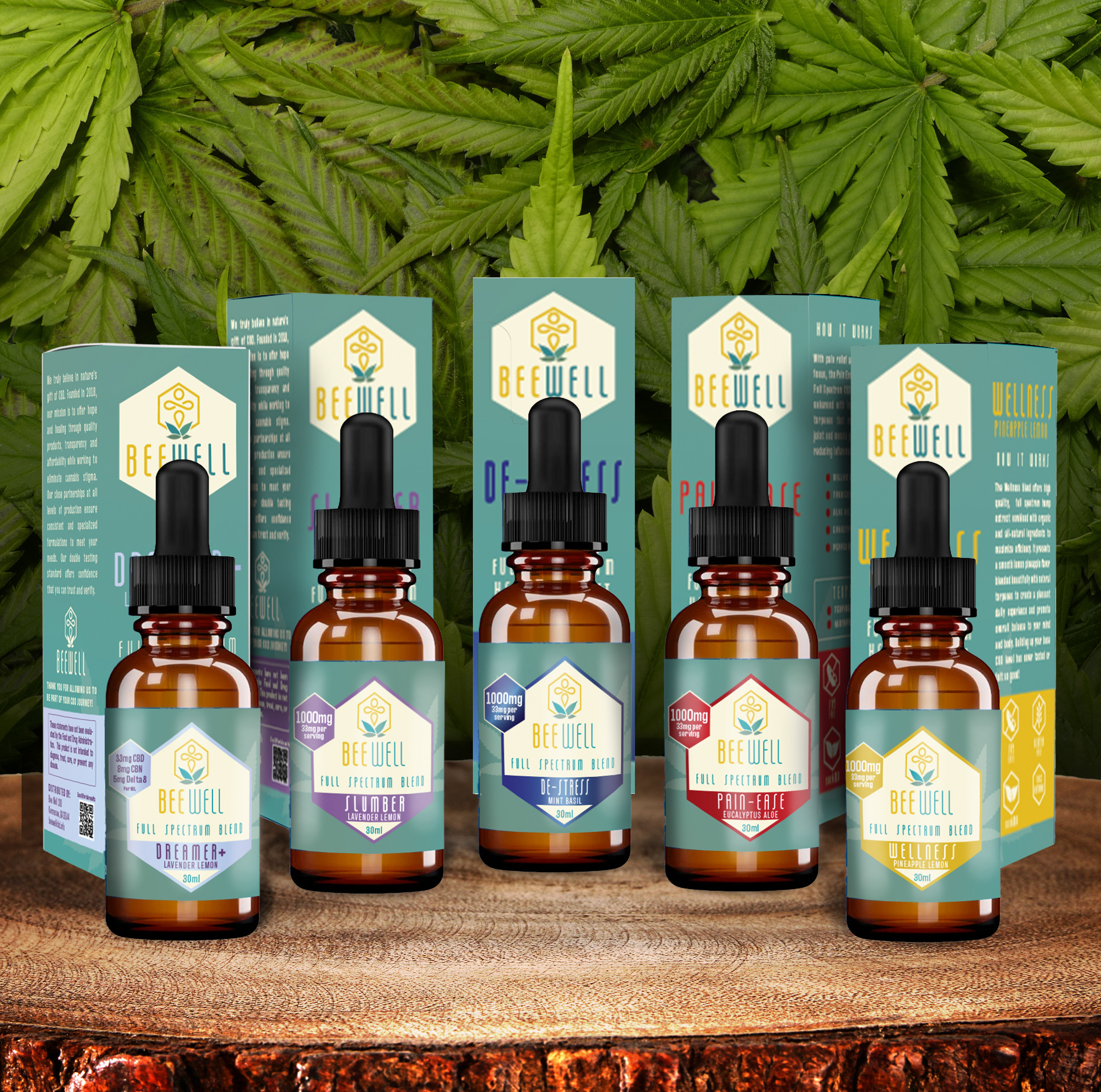
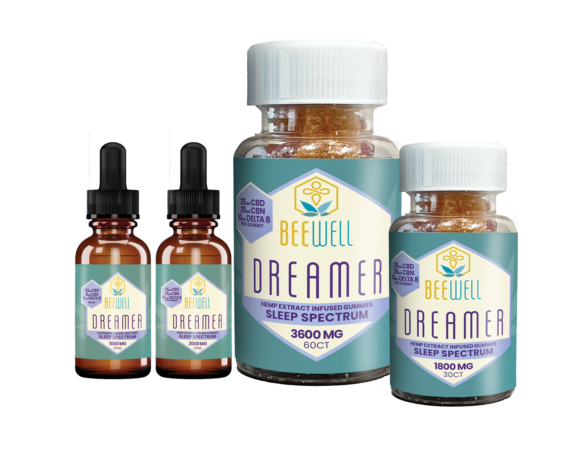
The newly designed logo symbolizes a bee encased within a hexagon, reminiscent of a beehive, and is complemented by a hemp leaf motif at the base. The typeface, Salah, was selected for its tall and slender form, harmonizing with the icon's boldness.
The color scheme integrates a deeper yellow, the signature bright marine blue, a soft light blue, and a dark greenish-blue. This combination conveys a sense of trust and health-consciousness, essential for the brand's identity.
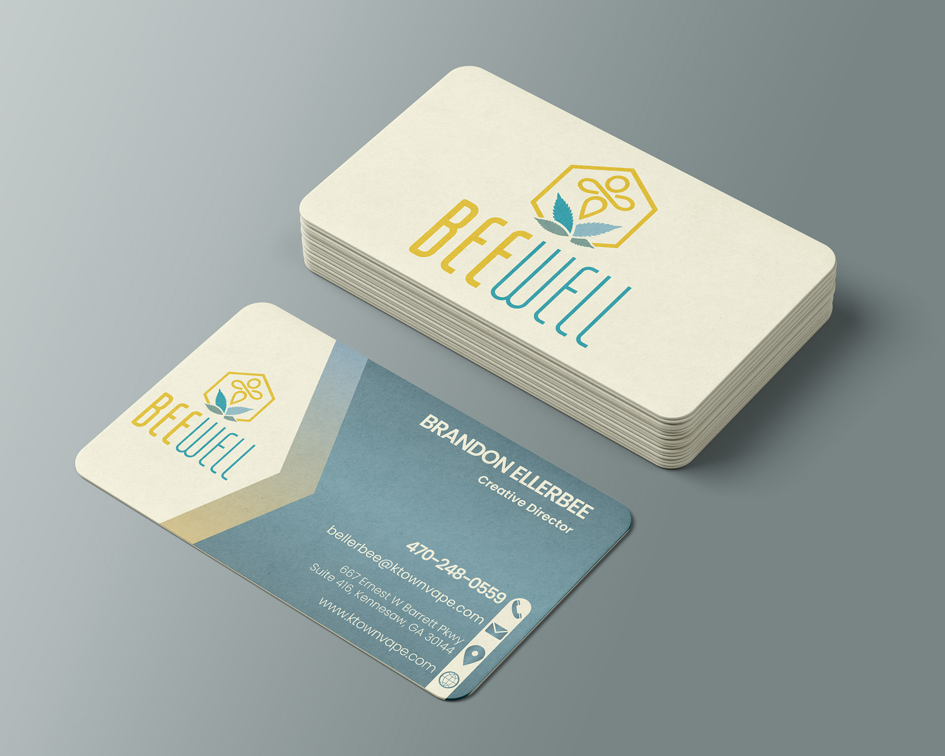
The portfolio below showcases various assets including business cards, product labels, packaging, billboard designs, in-store signage, folder design, and promotional t-shirts.
To explore more items and the full extent of this rebranding project, please visit www.beewellcbd.info.
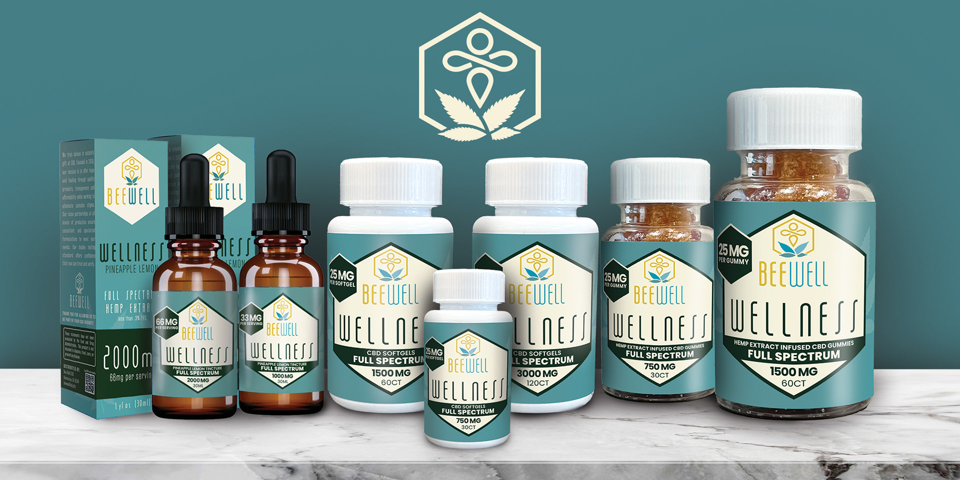
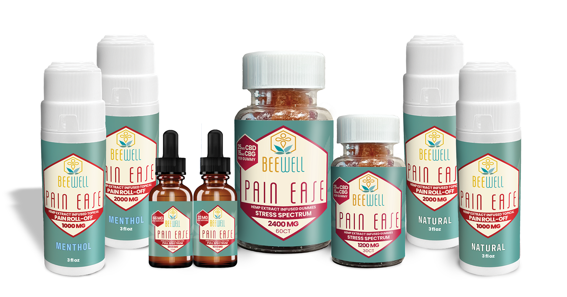
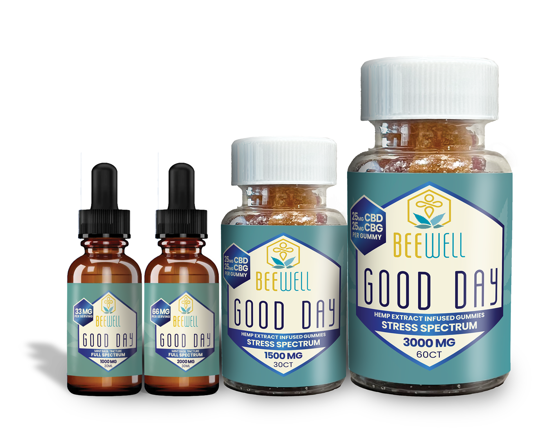
Label and Packaging design
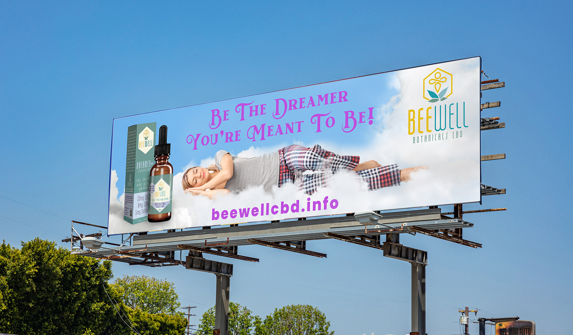
Billboard
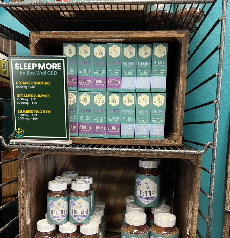
Everyday In-Store Signage.
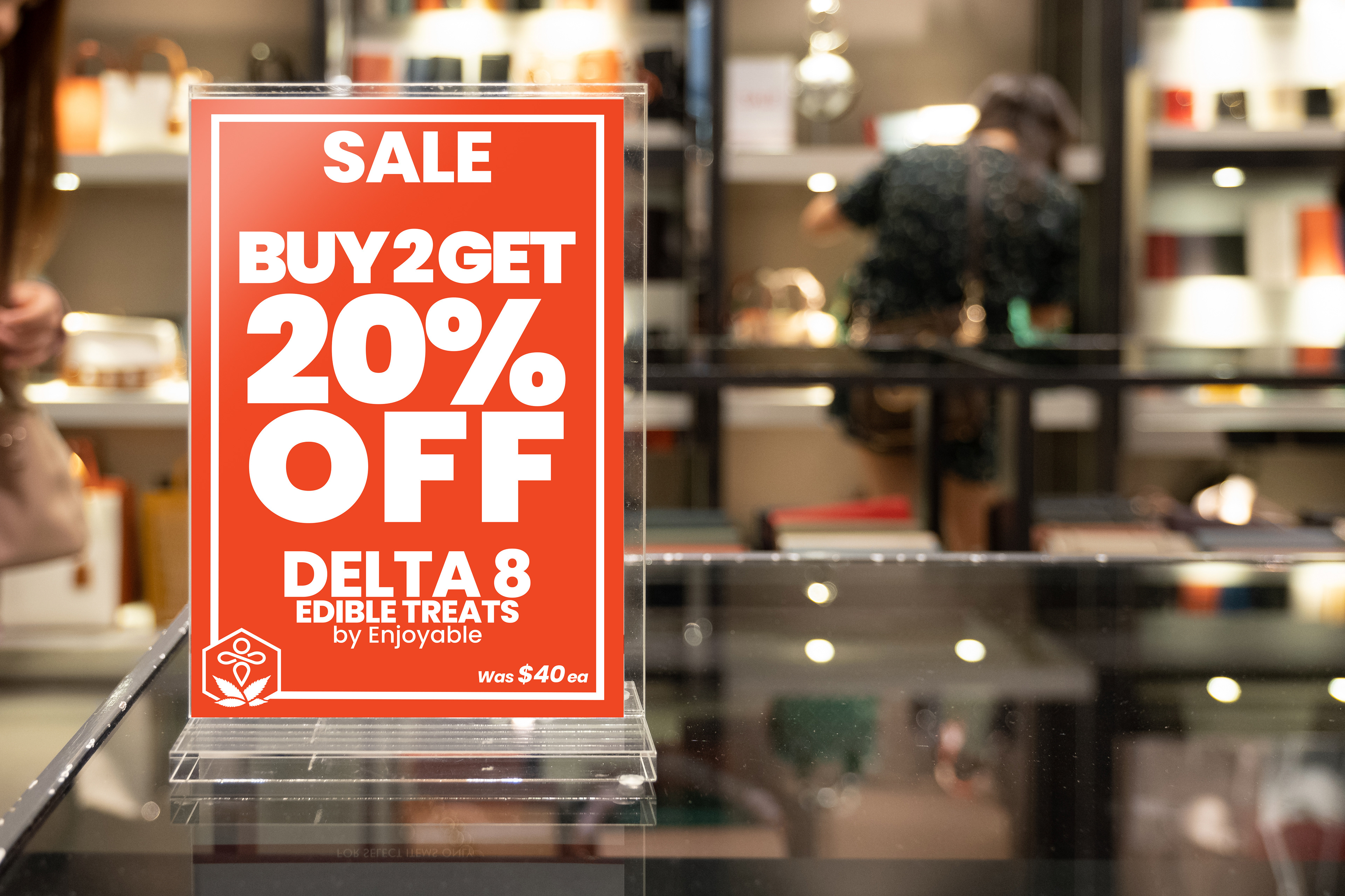
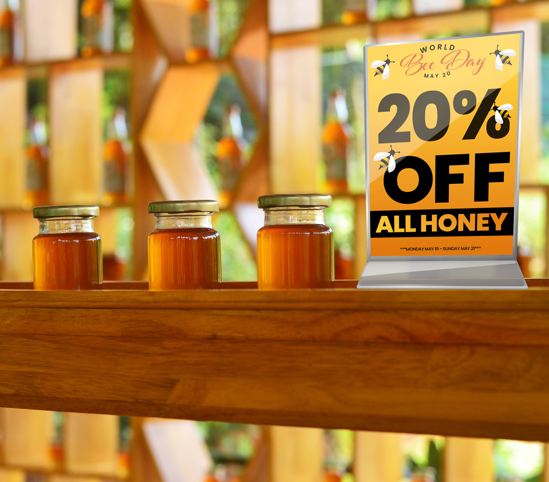
Sale Signage
Special Holiday Signs
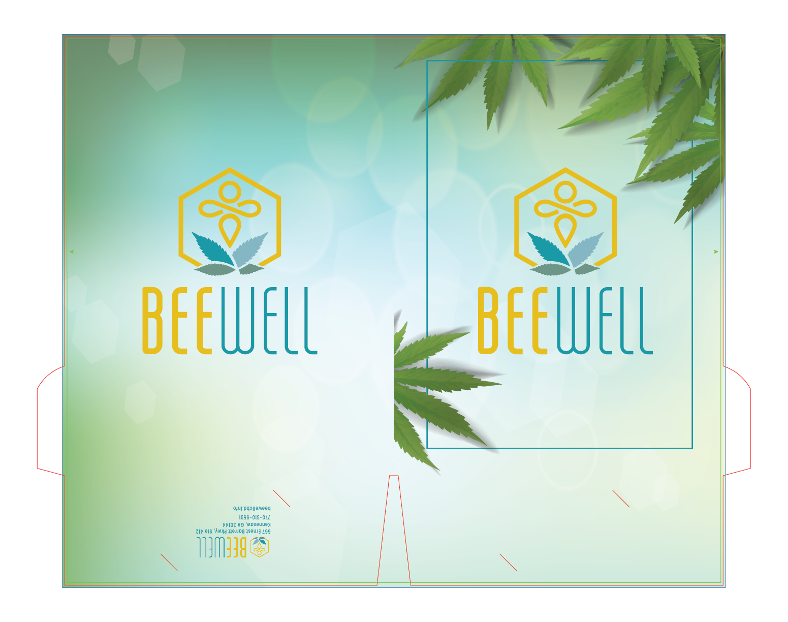
Folder Design
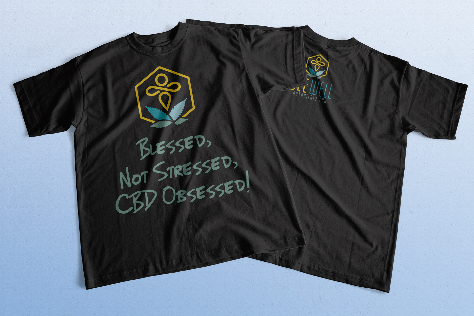
Our Most Recent T-Shirt Design
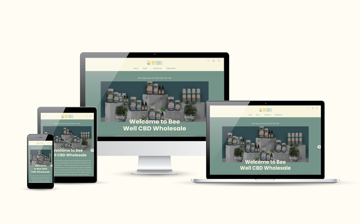
Web Design